by Ben Zackheim | Dec 2, 2014 | The Camelot Kids |
We’re going to do something different here. I’d like to show off Ian Greenlee’s art in a unique way.
Piece by piece.
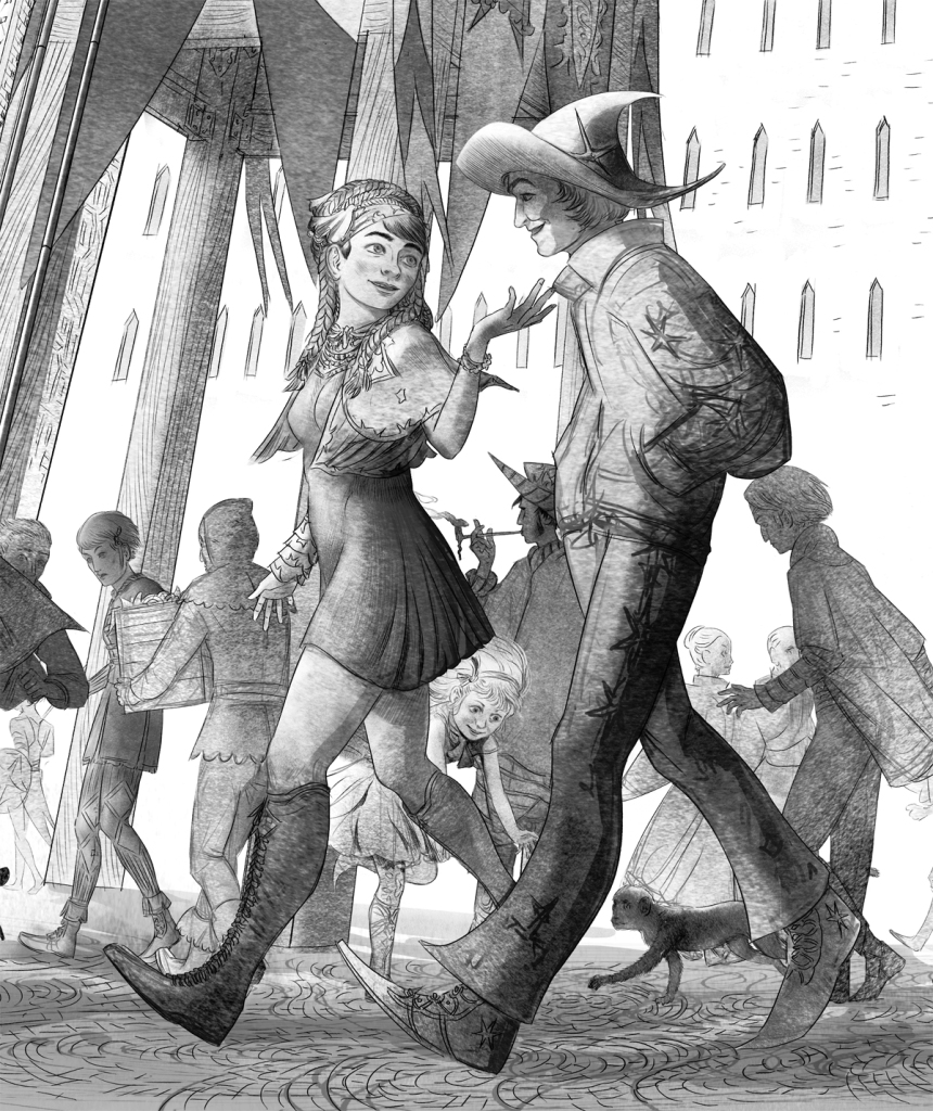
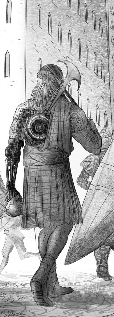
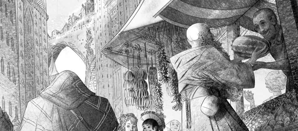
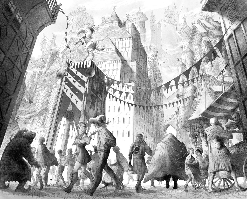
Ian’s work is spectacularly detailed. He works on a canvas the size of a house and loves to dive into minutia like no one else I know. To show this talent off I’m going to reveal his latest piece. It captures the moment that Simon Sharp walks into the fantastic town for the first time. I think Ian does a brilliant job of making us feel the awe that Simon felt. When you see the full piece all together, you’ll see what I mean.
I’ll update this post once per day until the softcover launch on December 12th, so bookmark it and come back to see the full illustration slowly come to life!
Enough talking! Take a look at this first tiny slice of a masterpiece!

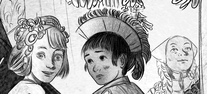
Slice #1: Girls in the Market

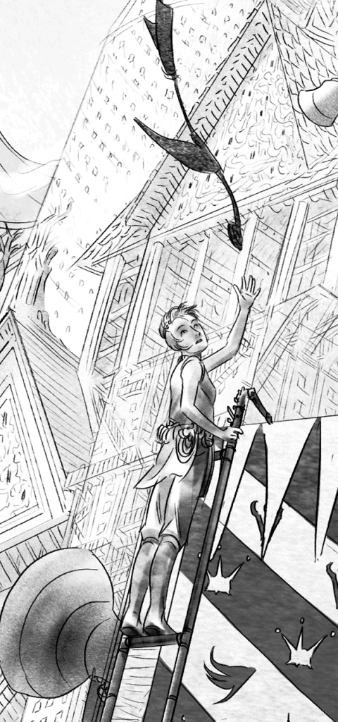
Slice #2: Getting Ready for the Fair

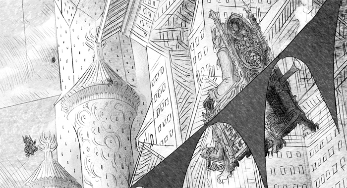
Slice #3: Watch Your Head!

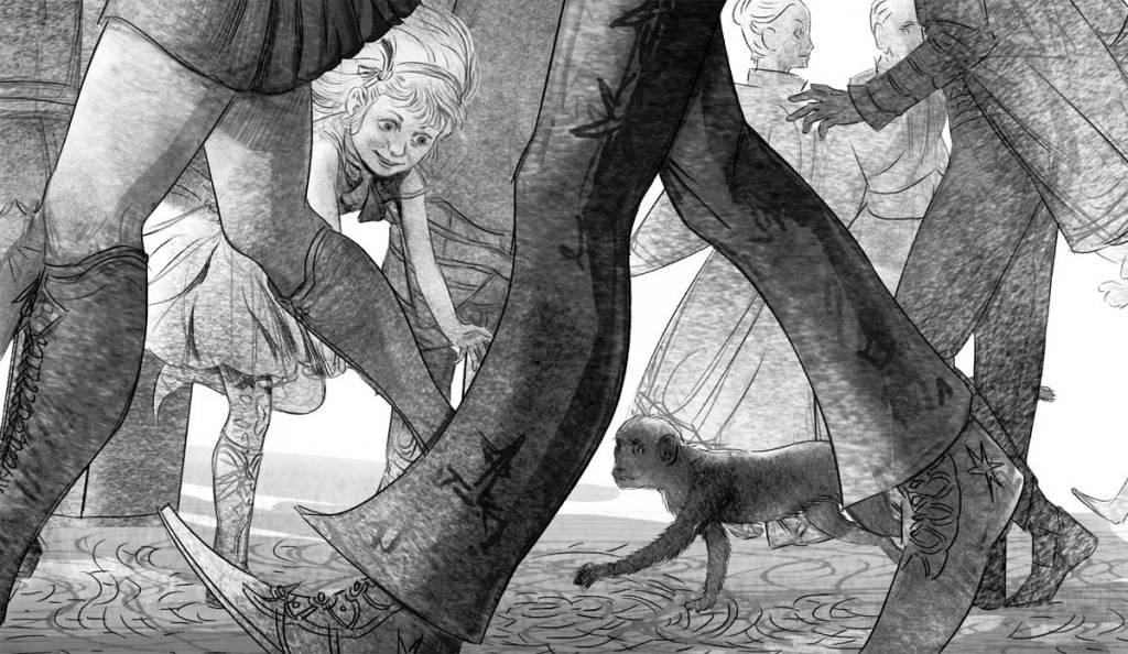
Slice #4: Girl, Meet Monkey

Slice #5: Young Lovers in New Camelot

Slice #6: Shopping for an Elbow

Any of these illustrations have enough detail to satisfy most artists. Not Ian.
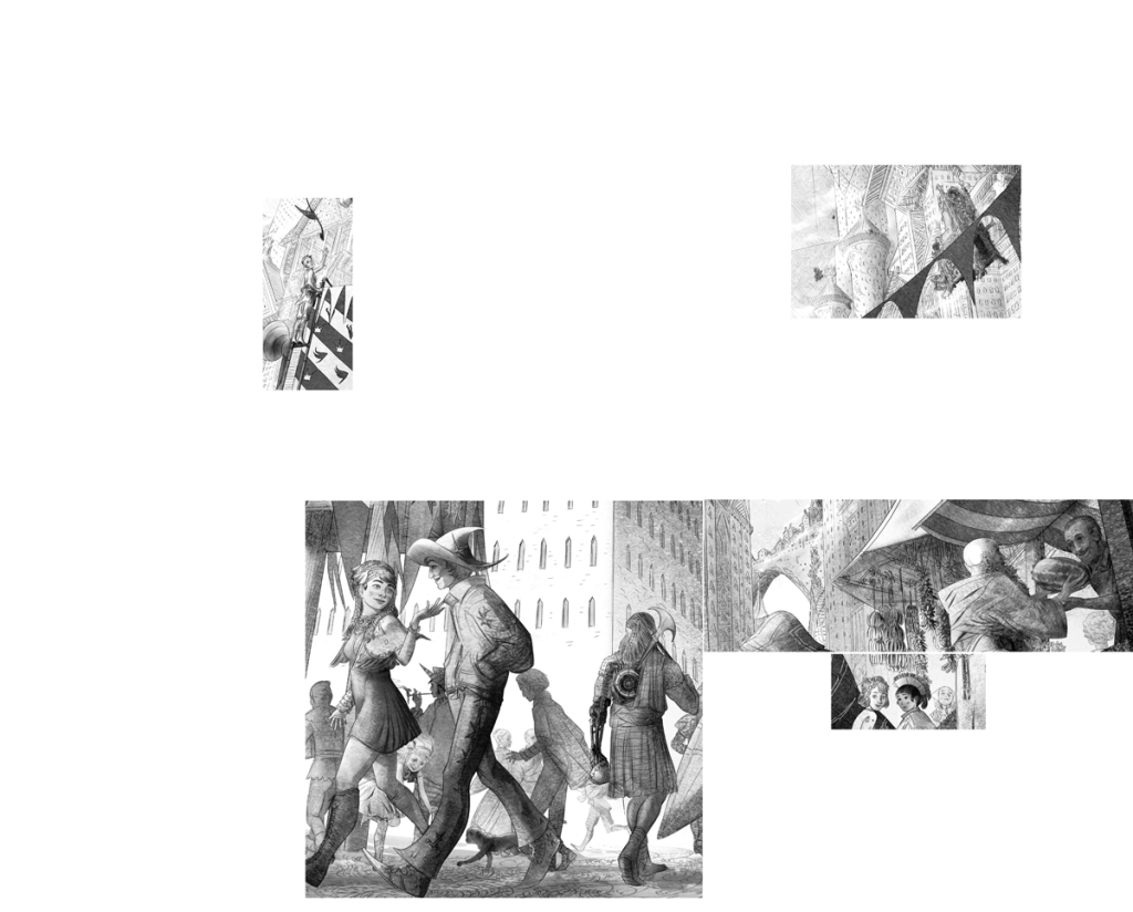
THIS is how big the above images are in comparison to the full piece!

Yeah…
And HERE is the full piece!

So what do you think? Want to read the story? Check it out in softcover! 500 pages of action, intrigue and images like this one…

by Ben Zackheim | Sep 19, 2014 | The Camelot Kids |
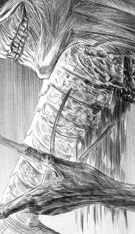
Rukkush! The former apprentice to Merlin makes his debut in The Camelot Kids: Part Two. Ian Greenlee, the artist for the book’s interiors, tweeted this little peek at a new piece that shows the elf’s sinister grin.
And those fingernails!
I suppose that’s what you get when you’re stuck in a room for a thousand years with no nail clippers.
Be sure to pick up your copy of The Camelot Kids: Part One on Amazon. The ebook is only a buck and it might just make you see Camelot in a brand new light!


by Ben Zackheim | Jan 15, 2014 | Writing |

Creating a book cover is a bit like mixing potions. There are definitely tried-and-true characteristics of a good cover, but there are also a thousand different types of covers that look great.
And, of course, a million ways to create a book cover that looks awful.
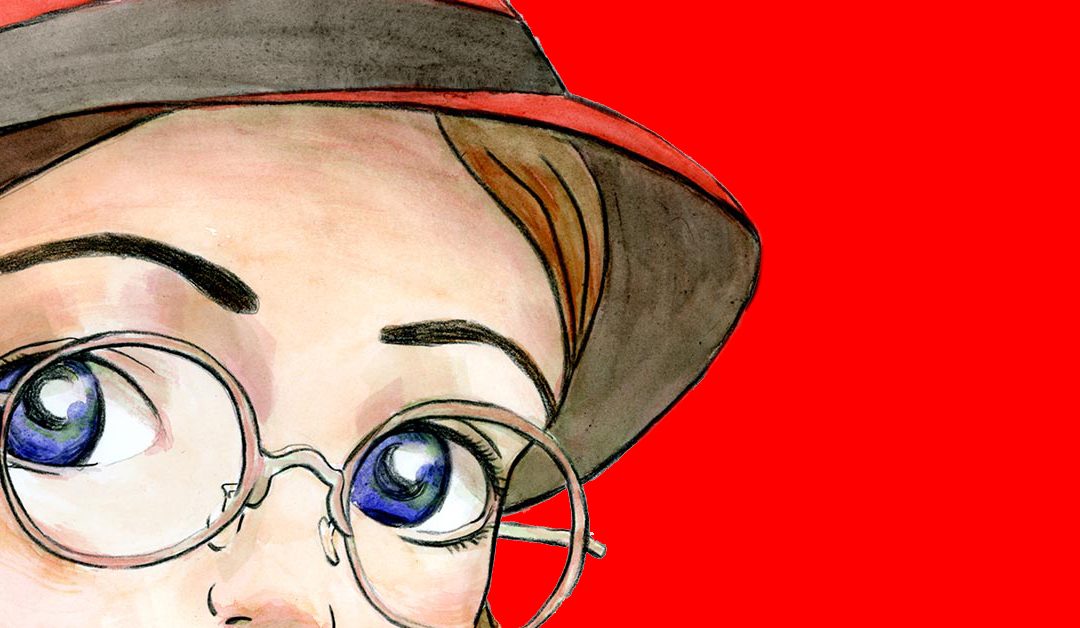
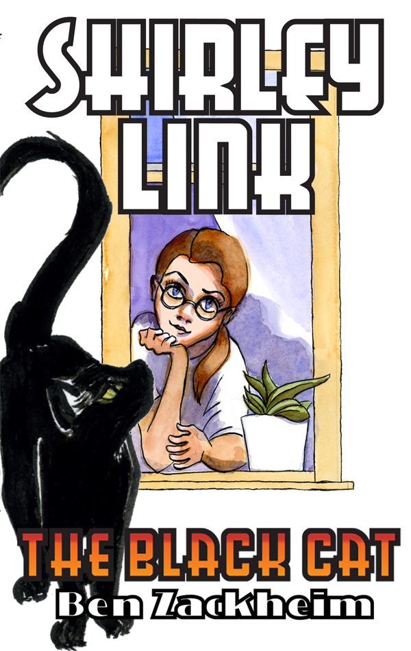
How does Robin Hoffman manage to make such great covers for the Shirley link series? It starts with her love of the character, which has been clear since she read the first draft of the first book in the middle school reading series, Shirley Link & The Safe Case. But, really, it all comes from her working her butt off!
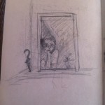
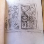
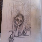
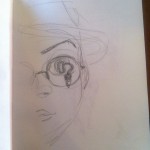
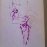
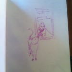
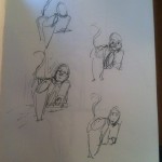
Here’s a peek into the process she goes through every single time a new Shirley cover is needed. Creating a book cover ain’t easy. But it sure is fun to watch happen. Step-by-step.
Click on the images to see ’em get blown up!
-

-
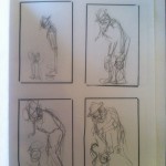
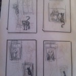
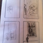
You can see Robin playing around with the relationship between Shirley and the black cat here. I love the way you can immediately see their connection just in their poses.
-

-
The playfulness continues! Robin is trying to find a way to show a bunch of information on a cover, including humor, relationship and easy-to-read symmetry
-

-
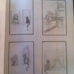
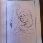
Here you can see her working with the question mark motif. As usual, she’s found the right symbol to focus on for the cover. No one gets Shirley like Robin!
-

-
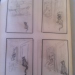
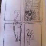
Still working on angles and that magic moment where cat and detective bond.
-

-
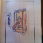
Color! Just to shake things up…
-

-
Notice how the strongest sketch is the one that ended up being closest to the final cover. Amazing how a good artist can just tell when she’s hit it on the head (whether she knows it, or not)
-

-
Again, the question mark motif where the tail reflects the story’s mystery along with the personality of the cat! Love this.
-

-
Playing with symmetry again. Robin will do anything to capture the right framing for a moment.
-

-
The final cover is coming together, but not before Robin tries out some more angles.
-

-
A little more detail. While I love this one, there’s not enough connection between Shirley and the cat.
-

-
Ooooo, very close to the final.
-

-
I love this one but the cat would have been tough to read on small screens.
-

-
Cat on one side…
-

-
Cat on the other side!
-

-
Working out placement now that the angle is clear.
-

-
Pre-final sketch.
-

-
Character study with Bad Kitty!

by Ben Zackheim | Aug 29, 2013 | Shirley Link & The Hot Comic, Shirley Link & The Safe Case, Shirley Link & The Treasure Chest |
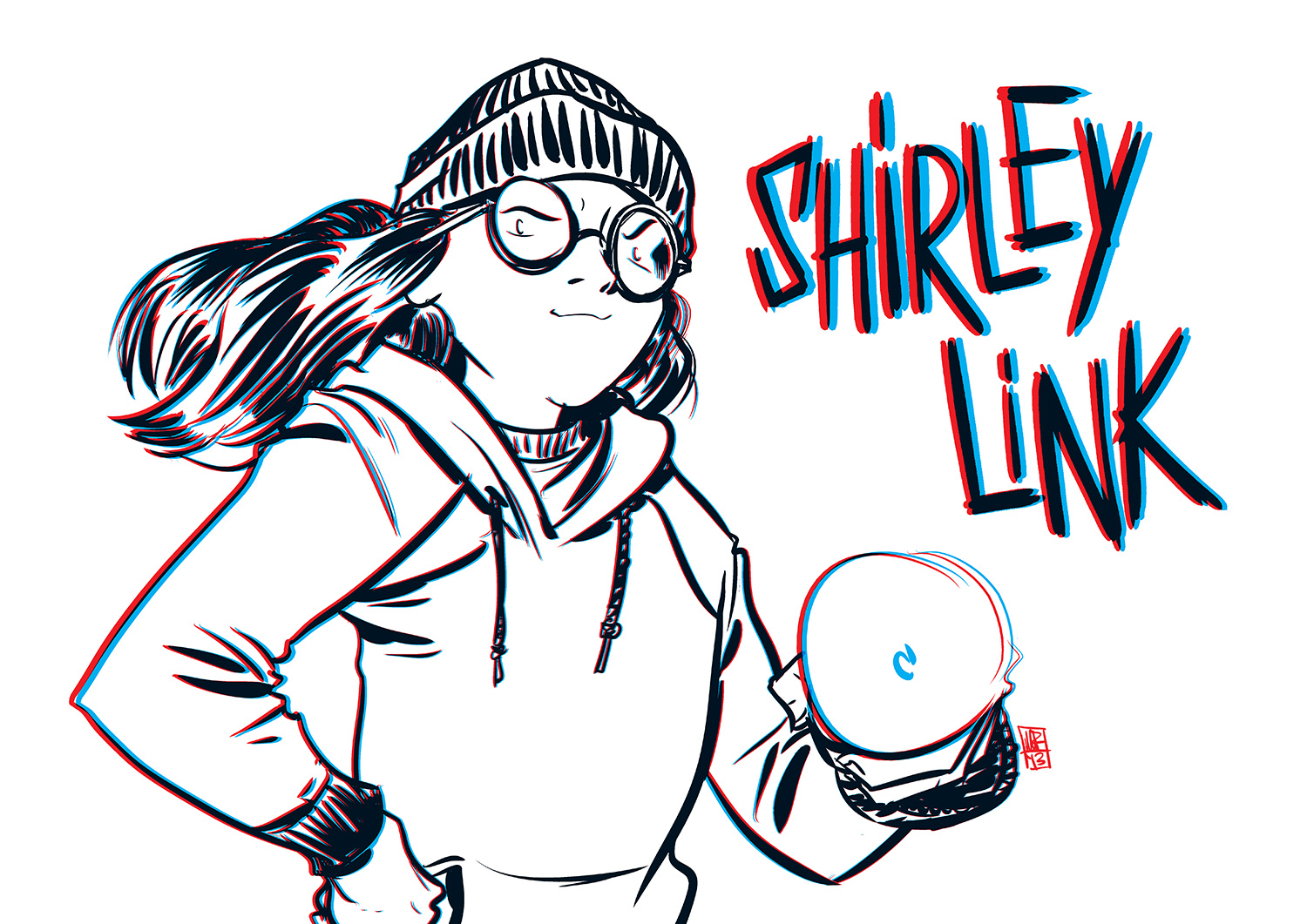
Thanks to my dear friend, illustrator-extraordinaire Nathan Fox, you can now see Shirley in 3D!
I recently wrote a blog post about Nathan’s excellent 3D illustration tutorial. I joked that I could make the tutorial a weekend project, and draw my favorite sleuth. I’ve always wanted to see Shirley Link in 3D…
Put on your 3D glasses! This is what I found in my email a few hours after publishing my blog post:

I’ve loved 3D since I was a kid. When I first popped on those glasses and read some 3D comic books, I was hooked. It was a bummer that the trend never caught on. Of course, the big upside of being nichey is that any new 3D comic is super special.
I don’t think anything will ever match this illustration, though. Not in my opinion. Thanks Nathan! Now Shirley is that much more real.
