by Ben Zackheim | May 16, 2013 | Book Promotion, Shirley Link & The Treasure Chest |
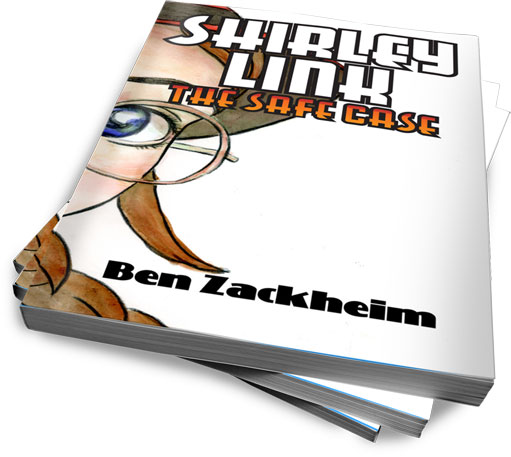
Shirley Link & The Treasure Chest, the third book in my Middle-Grade Mystery series, is out.
But the real good news is that today and tomorrow it is
FRREEEEEeeeeeee
eeeeeeeeeee
….
So go to Amazon and download your own copy. If you like it, give Shirley a review! And spread the word.
Shirley Link & The Treasure Chest clocks in at twice the size of the two previous books. I wanted to dig into the three teen characters some more, and reveal why they are such a great team. Shirley, Wylie and Marie are like the perfect storm. Between them, their loyalty, intellect, strength, bravery and faith in each other makes them the best sleuthing team of all time.
I look forward to writing more about them in the years to come.
Next up in the series is Shirley Link & The Black Cat. It should be a doozy.
Look for it this summer!
From Amazon (Shirley Link & The Treasure Chest):
Shirley Link loves pirates. Well, she loves the idea of them. She wouldn’t like them if they were running up the street stealing bikes, but digging for treasure and swashbuckling adventure are on the top of her to-do list. So when a clue pops up that there’s a hidden pirate treasure under her hometown, Shirley gets to work.
In Shirley Link & The Treasure Chest, the third volume in the critically-acclaimed Middle-Grade Mystery series, our heroine takes on her toughest challenge yet. But this time the stakes are bigger than ever. If she fails to find the treasure, or if it ends up being a hoax, then Shirley’s elderly neighbor, Mrs. Smiley, will lose her home to the bank.
More Shirley, Dad, Wiley and Marie than ever before. That’s right. Even Mr. Link gets to join in the adventure!
Reviews:
Emily Neuburger, Everyday Fun blog, Parents.com
“Shirley Link is a new girl detective series that my daughter is crazy about. This is an amazing series, my friends! Your kids will be hooked and you’ll feel really good about it.”
Edward Hemingway, Author/Illustrator, Bad Apple
“This Virginia Mars for the tween-set is funny, smart, and full of preternatural wisdom.”
PopBop (Top 1000 Amazon reviewer)
“There are early middle grade mysteries out there, but most of them have sketchy characters, and a lot of them plod along fairly predictable arcs. This series has an engaging heroine, a lot of attitude, and a much snappier overall feel.”

by Ben Zackheim | Apr 20, 2013 | Writing |
The first rev of the Wisdom CPU was a disaster.
The infant, Sam, was new to the world but the chip in his head was stuffed with 3000 years of history. If the gentle, neural prodding of the CPU worked, he would learn to never repeat the same mistakes humanity had made for millennia. Sam would be the first generation of a New Human.
One problem.
To track his progress, a network connection transmitted Sam’s decisions to HQ. Sam was born hungry and it upset him. The boy’s anger instantly hacked the signal and launched a Denial of Service attack, which brought down the power grid state-wide. Three critical patients in three hospitals died, including his own Great Uncle Harry. Almost 1000 airplane passengers were dead by the time Sam’s circumcision wrapped up.
He was indeed a new kind of human — one who would make us yearn for our old habits.

by Ben Zackheim | Mar 21, 2013 | Writing |
He didn’t trust his shadow. No, it wasn’t because it followed him everywhere. He’d heard enough of that joke from Step-Dad Dan.
The problem was it would hurt him every chance it got.
It started on the basketball court. His heel stuck to the ground when no one was anywhere near him. Then, outside the deli, he got bit on the neck. At least it bled like a bite.
Near sunrise, he perched on the wall behind his dorm, facing west so he’d see the shadow before it saw him. His fingertips brushed the grip of Dan’s Glock. Shadow would have a gun too, he guessed.
The sun pushed a bar of light over the mountains, too slim to make a shadow yet.
A van passed by, brights beaming.
He squinted in the headlight’s glare, but managed to glance at the shadow behind him, before he never saw anything again.

by Ben Zackheim | Mar 19, 2013 | Book Promotion, Writing |
To read about how WordPress can help writers, see Part One!
In my experience, authors are hesitant to sell. That’s okay, as long as they do it anyway. (Tweet this instantly!)
I’m not going to tell anyone what their site should be. Only you know what you want to get out of it. You may just want to tell stories. Blog. Podcast. Post pics of cats. But if you want to use your site to highlight you and your books then I have some pretty strong, and well-tested, opinions. After years at Viacom, Sony, ESPN and AOL, building games and game sites, I can tell you that selling something requires focus.
With focus in mind, here’s what every fiction author website must do:
Highlight the books
Have one or two strong calls to action (sign-up for newsletter, buy, download)
Include blogging, video, illustrations, SOMETHING to keep folks coming back twice a month.
What does an author website need to have? BaB!
I call these fundamentals, BaB, which stands for Books/action/Blog.
Why BaB? Because it wraps up what your book site is all about. Selling yourself and your books.
Think about it for a moment. If you stumble on a site that’s selling something, you’ll visually scan it and, whether you know it or not, you’re making a lot of judgments in a split second.
- Is it pretty? Assuming you don’t go with a puke pink palette, Wordpress will help make that first impression go well. That’s one of WordPress’ biggest advantages. You need to work hard to make it look bad.
- What is being sold and does it look good? Get the best book cover you can afford and highlight it with a WordPress product page. I’ll cover the top themes with product pages in a later post.
- What else is here for me? News? Advice? Videos? Contests? Podcasts? Ways to share? Which social network is important to this writer? Is the site worthy of bookmarking?
By executing on the above three points, your site will do the most important thing it can do for you …
…show the reader what your priorities are…
You know how biz folks are always talking about how smart people remove all obstacles to buying a product? The same holds true of site design. Don’t make me think! Do not assume that I found your site because I wanted to see your book, or you. Odds are I did a search and stumbled on you. Now it’s up to you to convert me. Yeah, it’s like sprinting from a standstill. It’s hard, but you have to try.
Want to see what I mean? Okay, go to Jay Asher’s author page.
I’m not nuts about the overall design, but all the elements of BaB are there, and they’re in the right place. Notice the big honkin’ Buy Button in the upper left, which is where most eyes land when they first look at a page. I’m asked to buy before I even know what the product is! But that’s okay because, lo and behold, there’s the pic of the book. Now I know I’m on an author’s site. Jay gives more prominence to News than to Reader Reviews, which is odd, but they’re both really obvious from the get-go.
In the top menu I see there are a whole bunch of reasons for me to come back to the site if I like the book. There are links to his blog and to videos that tie in with his books. The site is bookmarkable. I would also follow the site, which I’ll explain in a later post.
So, yes, Jay Asher’s site has BaB! The books and buy action are tied at the hip on the top of the page, which is how it should be. And there’s content to keep the reader coming back to see what he and his characters are up to next.
Maggie Stiefvater‘s site tackles things in a different way. But let’s check out what she does and (maybe) why. Does Maggie have BaB?
It’s a design-heavy site, with a long load time, but when it does load it intrigues (just like her writing). She knows her audience (young adults) and her pub has made a judgment that the design of the site must capture her audience’s eye and let them know they are definitely in the right place. Since Maggie is busy building a very potent brand, where she is the product, she’s very prominent. Still, notice the biggest words on the page? “Welcome Reader”. She knows that she needs to let folks who don’t know her well that they’re on a writer’s site. Books are here. If you navigate to the books, you’ll find a very succinct and pretty presentation. You can also get fresh content if you come back to the site for her blog.
But this is where things fall apart. Where can I buy her books? Nowhere. I need to either search for the books manually on my site of preference, or go to one of the books’ official sites. From there I can find a Where to Buy section waaaay down on the page. Maybe the publishers figure she has a big enough name so they don’t need to worry about losing sales. But even the slightest bump in the road to purchase is lost money.
I’ve noticed this weakness in a lot of big publishers’ author pages. Maybe they know something I don’t know, but I’d say a design that hides the buy button isn’t doing anyone any favors. Including the readers.
So enough with the studies. How can you take this simple concept of BaB and apply it to your site with WordPress? We’ll explore the answer in the next post.
See what a good landing page needs to have to get the job done. And read part three of my series on WordPress for authors and writers.
You may also like:
WordPress for authors and writers (part one)
WordPress for authors and writers (part three)
WordPress for authors and writers (part four)
by Ben Zackheim

by Ben Zackheim | Feb 18, 2013 | Book Promotion, Writing |
This is a follow-up to a previous post.
I’ve received some feedback on my post about advertising on Goodreads, and it looks like some people are interested in getting into Goodreads, but haven’t made the plunge yet. This sequel is for you!
The thing I like about Goodreads is that it’s filled with readers of all ages. The best way to get to know people who share your tastes is search their groups. I’m still seeking out my niche, but I’ve found lots of helpful and supportive people by just making a page for myself .
If you’re an author you can either “claim” the books you’ve written, or you can upload your book data manually. Once you have an author page with books you can start to find friends by joining group discussions. The best way to sum it up is that Goodreads, while a bit obtuse, is a microcosm of all the reading/writing forums you’ve ever joined on the Web. It’s a wild west of discussions and contests and promotions. The benefit for the author is that you only interact with dedicated book lovers.
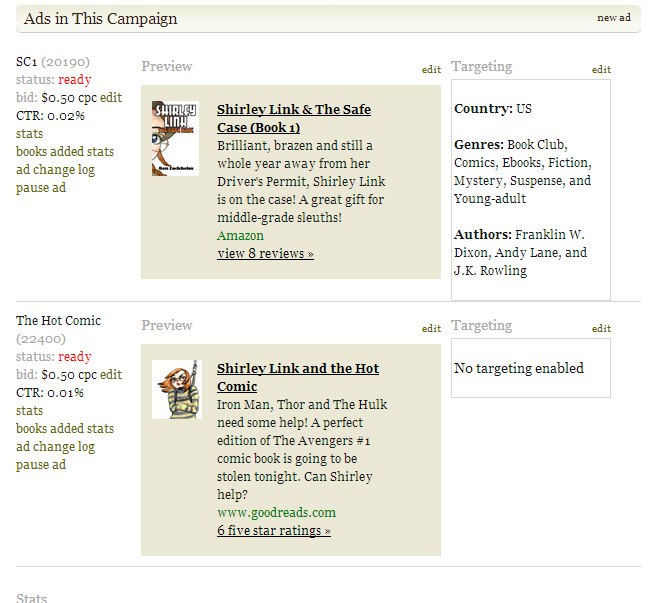
Goodreads started a service called Goodreads Self-serve Ads. You can buy, for up to 50 cents per click, ad space on the right or left column of some of their pages. The ads consist of a small image, ad copy and a link to wherever you want. You can set aside any amount as your budget (I chose 10 bucks) and you can track your ad’s performance.
The big benefit of ads on Goodreads is that everyone who sees the ad is more likely than the public at large to be interested in your ad. Still, to ensure you get the most bang for your buck Goodreads allows you to target your ad, meaning you can offer the ad to certain kinds of Goodreads customers. They allow you to show your ads ONLY to people who like (for instance) mystery and YA. You can choose as many genres as you’d like to target, but it’s a fine line you’ll walk in trying to target correctly.If you target too broadly you risk getting people clicking on your ad who are not interested in your kind of book. That’s wasted money. Conversely, if you target too specifically you can filter out perfectly good customers and not see anyone click on your ad at all.
You can also target customers by the author they like, which is an interesting filter that I plan to test out in my next campaign. I need to find out from my current readers who they think I’m similar to!
Advertising on Goodreads
As you can see in the image below, I set my daily budget to 2 bucks. That meant I was planning to pay for a max of 4 clicks on my ad (they charge up to 50 cents per click). I set 10 bucks as the campaign budget, meaning I planned on eventually paying for 20 clicks at 50 cents each. As you can see from the views data, a lot of people had the ad put in front of their faces. A “view” is simply defined as “your ad showed up on the person’s web page”. Goodreads can’t actually guarantee that someone saw and read the ad, they can only tell me that 116,129 people had the ad served to a page that they loaded. Of those 116, 129 Goodreads people, 20 people clicked on my ad. That is .02%

While that sounds miserable, it’s a middling result. A super success would be half a percent point considering that Goodreads doesn’t give you a sexy place on their page to put your ad. In the final analysis I got some exposure for my book series brand, and 20 people showed interest in buying the books.
Lessons learned
And here is where I learned my biggest lesson. Because I don’t have a sale page on my personal website where I can track traffic, I can’t see how many people actually bought the books. I can look at the dates when the ads ran and guess but that’s not a good way to measure these things. My conclusion is that it’s best to have a page with a shopping cart on your own site so you can check the traffic for your site and see “oh, he came from Goodreads.com and he bought a copy on my site.” This way you can see how successful the ad campaign is AND tweak your ad and/or purchase experience next time around.
I’ve learned about a trick and I plan to use it on my next book. According to Tom Corson-Knowles, you can track conversion on Amazon pages by placing an image of yourself in your book description. The image should be hosted by you and served from a bit.ly url. The bit.ly url will allow you to go to the bit.ly site and check traffic for the link. This way you can find out a bunch of user data on who went to your Amazon book page from Goodreads. I haven’t tried this on my Amazon profile because I use Amazon’s Author Central, which does not allow html in their profile form. However, if you are on KDP and have not signed up for Author Central, you CAN use the KDP profile form to enter html, including the bit.ly link. There are some tricks to it and I advise that you buy the three dollar book on Amazon, or borrow it if you’re on Amazon Prime. It’s worth it. It appears that Amazon has changed their policy. I tried to use this trick on a new book using KDP and my html was rejected. As of now, I’m not aware of a way to see traffic to your Amazon page.
Goodreads, for their part, advises ad buyers to make their ads link to the book’s Goodreads page. The Goodreads customer likes their ads to stay within the Goodreads ecosystem because they’re loyal and enjoy the experience.
I saw an uptick in my ads’ performance (known as CTR, or “click through rate”) when I did two things:
- Updated the copy. I went for the soft sell, instead of the hard sell. I toned down the language and removed the “Get the book for Xmas”-type wording. The hard sell doesn’t work well on Goodreads.
- I changed the ad so it linked to Goodreads instead of Amazon. This made the link at the bottom of the ad read “Goodreads” instead of “Amazon” which, again, appears to be what Goodreads customers prefer.
I hope this post now makes it clear what the benefits of Goodreads is as a platform and as a place to advertise.
by Ben Zackheim

by Ben Zackheim | Feb 12, 2013 | Writing |
Shirley Link was at the end of her rope. In fact, she was just one tight grip away from falling off of it. As she contemplated the waves below, frothing like they couldn’t wait to eat her up, she wondered if she’d ever see her friend again.
Wylie had been missing for a week. Not like him.
Her search had led to Torrey Pines Beach. A red sand, unique to the area, was found all over everything in Wylie’s bedroom.
Shirley had been about to rappel down when she was shoved off the cliff.
But who did it?
“Looks like you could use some help,” someone said from above.
He peeked over the edge.
“Wylie?”
No, it couldn’t be. He’d never do this to her. They were best friends!
He reached his hand toward her, and smiled.
She’d come to save him, but now he was saving her.
She hoped.
Read more Shirley Link here.
