Creating a book cover is a bit like mixing potions. There are definitely tried-and-true characteristics of a good cover, but there are also a thousand different types of covers that look great.
And, of course, a million ways to create a book cover that looks awful.
How does Robin Hoffman manage to make such great covers for the Shirley link series? It starts with her love of the character, which has been clear since she read the first draft of the first book in the middle school reading series, Shirley Link & The Safe Case. But, really, it all comes from her working her butt off!
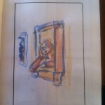
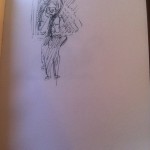
Here’s a peek into the process she goes through every single time a new Shirley cover is needed. Creating a book cover ain’t easy. But it sure is fun to watch happen. Step-by-step.
Click on the images to see ’em get blown up!
- You can see Robin playing around with the relationship between Shirley and the black cat here. I love the way you can immediately see their connection just in their poses.
- The playfulness continues! Robin is trying to find a way to show a bunch of information on a cover, including humor, relationship and easy-to-read symmetry
- Here you can see her working with the question mark motif. As usual, she’s found the right symbol to focus on for the cover. No one gets Shirley like Robin!
- Still working on angles and that magic moment where cat and detective bond.
- Color! Just to shake things up…
- Notice how the strongest sketch is the one that ended up being closest to the final cover. Amazing how a good artist can just tell when she’s hit it on the head (whether she knows it, or not)
- Again, the question mark motif where the tail reflects the story’s mystery along with the personality of the cat! Love this.
- Playing with symmetry again. Robin will do anything to capture the right framing for a moment.
- The final cover is coming together, but not before Robin tries out some more angles.
- A little more detail. While I love this one, there’s not enough connection between Shirley and the cat.
- Ooooo, very close to the final.
- I love this one but the cat would have been tough to read on small screens.
- Cat on one side…
- Cat on the other side!
- Working out placement now that the angle is clear.
- Pre-final sketch.
- Character study with Bad Kitty!


That’s pretty cool! Dani and I went through a long back and forth while trying to figure out just what the new Ninja Librarian cover should look like. It was cool to see her take my inchoate ideas and come back with sketches!
It’s probably my favorite part of the publishing process. We live with ideas in our heads that we need to get out using words. But, when we’re forced to think about a cover, our brains switch to visual mode. I often find myself making small changes to my story once the cover is complete.