Select Page
The $11 Million question: Is KDP Select worth it?

The $11 Million question: Is KDP Select worth it?

Yes, Kindle Direct Publishing Select is good and bad for writers

I’ve wanted to write this post for a long time. I’ve used KDP Select for every one of my Shirley Link books at one time or another, and I’ve had some epiphanies about the KDP Select Global Fund that I’d like to share. Some of my insights come from watching Amazon grow since its early days. I think I’ve identified some consistent behavior that works for us little guys, and some bad habits that do not work for us in the least.

The benefits of KDP can be summed up quick and easy (just like Amazon likes it!):

  • Get your share of the $11 million KDP pie (known as the KDP Select Global Fund)

  • Free promotional days

  • Countdown deals

  • 70% on all sales to Japan, Brazil, India and Mexico.

  • “Promotional possibilities”

I’ll cover the KDP Select Global Fund today. The rest of the touted benefits will be covered in their own posts.

Is Kindle Select Global Fund worth it?

The Amazon Treasure Chest: Do not pass go, do not collect $200

If you’re an indy writer, there’s a number you see floating around the mondo web. It’s a distracting number. It’s the kind of number that forces you to pay attention. Amazon loves to tout it. Lucky authors swear by it. And the rest of us are mostly confused by it.

$11 million.

The $11 million is cash from the KDP Select Global Fund that Amazon doles out to authors who opt-in to KDP by offering their book(s) exclusively on Amazon. If an author signs up for KDP Select and her books are borrowed by Prime members then she gets a cut of the monthly-updated fund.

Here’s how it works in a nutshell:

Sally is an Amazon Prime member. That means she pays $89 a year to get free shipping and other benefits from Amazon. She browses for books on Amazon and stumbles on one for sale at $2.99. But what’s this? Just above that price is a message informing her that she can read the book for free because she’s a Prime member.

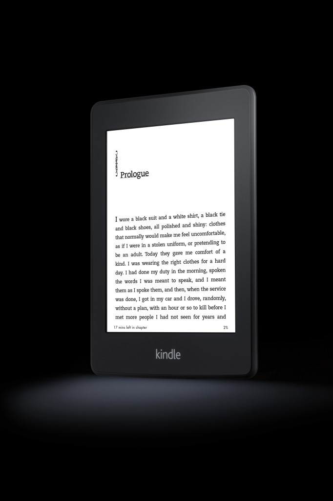
Kindle Direct Publishing KDP Global Fund borrow book

All she has to do is borrow the Kindle book for as long as she wants and then check it back in from her device when she’s done. She decides to borrow the book.

The author gets up the next morning and checks her sales. In the Units Borrowed column of her online report (or the “Units Sold or Borrowed” column on her downloaded spreadsheet) she sees that someone borrowed her book last night. How much will she get paid for this borrowed book? Amazon determines the amount based on the size of the till (usually around $11 million) and the number of books borrowed in that month. Whatever percentage of the overall borrows that a book delivers is the percentage of the till that the author will receive.

I’ve seen first-hand that the amount paid for the borrow often matches or exceeds a straight sale.

So that means KDP is worth it!

Photo by David Masters

Well, maybe.

Mad Cat by Melissa Wiese

There’s an old saying that comes to mind. “If you want to win the lottery, you have to buy a ticket.” One of the reasons that Amazon touts their monthly number is to activate that same trigger in your brain that sweepstakes do. Yes, you could win the lottery and KDP could do bonzo business for you. But unlike a lottery, you can do very well on Amazon, and in self publishing without it. You can find a following and make a good living. So you don’t have to buy a ticket to win on Amazon. But you do need to join KDP if you want a slice of the prize. A slice of the prize that could get you more visibility on Amazon, and consequently more sales.

The KDP treasure chest varies by month. It’s been over 10 million more than under a million in 2015. But what does that mean? Do you really have a chance to get a piece of that large pie?

Here’s the playing field you’re performing in. There are over 20 million Amazon Prime members who can check out your KDP Select book for free. Amazon has a big stake in showing those millions of people all of the amazing benefits they get for their $89 membership fee. One of those amazing benefits is your book!

But does Amazon do enough? Or, like the $11 million hard-sell, is it an ethereal opportunity, floating around for a few dozen people to leverage?

We’ll cover that in my next post about “Promotional possibilities.” Why do I have that term in quotes? Because it belongs there. It really, really belongs there.

Go to part 2!


by Ben Zackheim

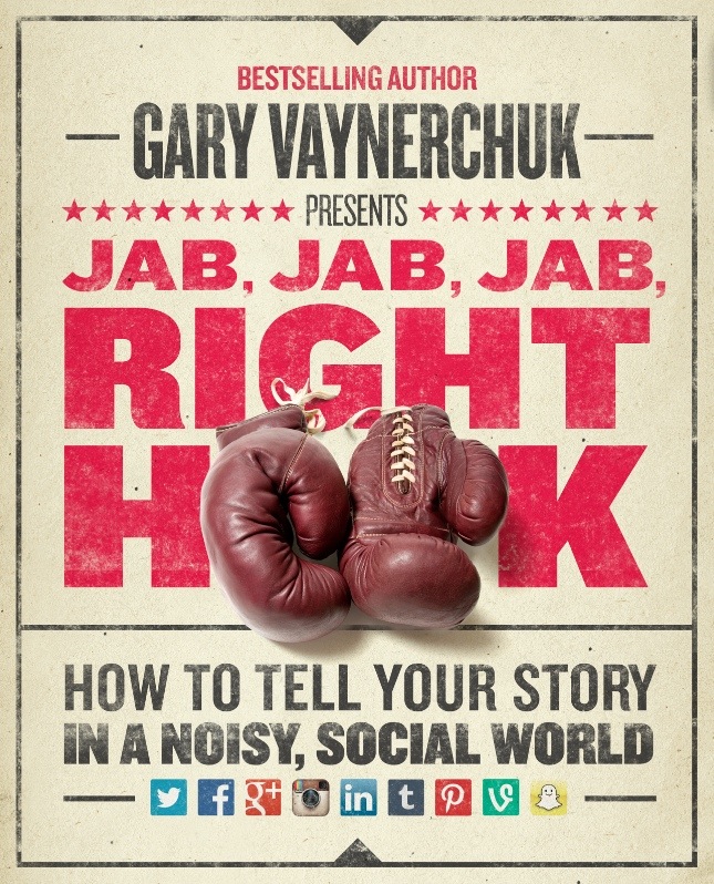
Jab, Jab, Jab, Right Hook by Gary Vaynerchuk: How Facebook is like a kidney punch

Jab, Jab, Jab, Right Hook by Gary Vaynerchuk: How Facebook is like a kidney punch

Gary Vaynerchuk Jab, Jab, Jab, Right Hook

I like to poke fun at social marketing, but I do respect those who can do it well.

I’ve been reading Jab, Jab, Jab, Right Hook by Gary Vaynerchuk. The premise of the book is that social marketing is like boxing, where you loosen up your target with jabs, then deliver a strong hook to close the proverbial deal. While he makes a lot of great points, my favorite advice covers the three characteristics of a great “right hook” social network post.

From his book:


1) They make the call to action simple, and easy to understand.
2) They are perfectly crafted for mobile, as well as all digital devices.
3) They respect the nuances of the social network for which you are making the content.


You’ll have to buy the book to dig into the meat of it, but he is onto something. I’ve found that a simple message always works best, especially if you know exactly who you’re trying to reach. It’s not new advice, but it’s tightly packaged in a list that I can put on a sticky note. Vaynerchuk also gives us his take on what exactly the nuances of each social network are, so the particulars of #3 are covered. Actually, the examples of good and bad social posts is the best part of the book. We get to see some hilarious near-misses, dead-on copy with complete photo failures, and so on.

You’ll close the cover with a new sense of what’s possible, which is what the author is going for. His frustration with how business is done is palpable throughout the tome. I get his irritation, having worked at Sony, Viacom and Aol over the years, it was rare that something nimble and new was crafted. Hopefully JJJRH will sit on the desks of managers throughout the mondoweb.

I recommend the book to anyone who’s ready to take social marketing seriously. One caveat (where I risk sounding stuck-up, but I’d rather sound stuck up than recommend a book that’s not a good fit!): The book is written clearly, but it does assume readers have struggled with the ins-and-outs and ups-and-downs of social marketing. If you’re new to this world then you’ll probably end up reading sentences a couple of times to get the gist. But when you do get it, you’ll be ahead of the game.

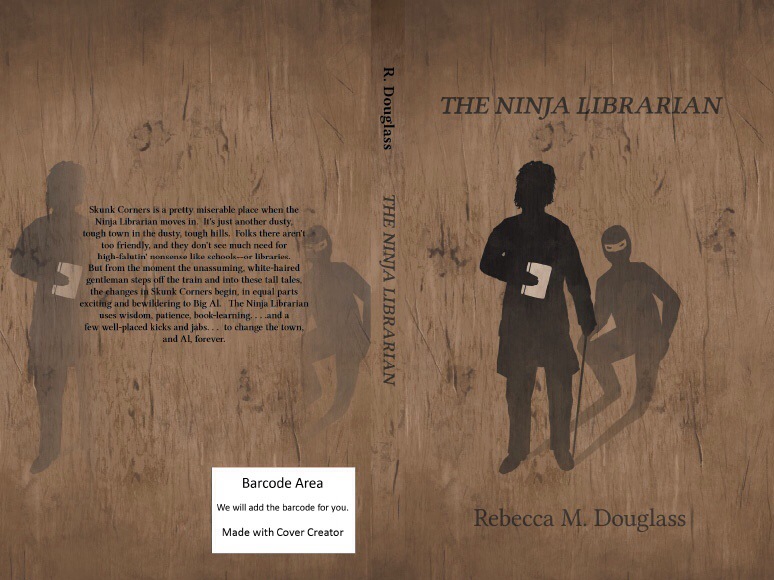
The Ninja Librarian by Rebecca Douglass is one of my favorite books of 2013

The Ninja Librarian by Rebecca Douglass is one of my favorite books of 2013

Book Giveaway

When I joined “The 12 Authors of Christmas Blog Tour” I did not know I’d fall in love with a ninja librarian. An older gentleman, at that. Jemima Pett, the creator of the blog tour, asked if I’d review the book. Of course I jumped at the chance. With a title like Ninja Librarian, who wouldn’t want to crack the story open asap?

But I was taken in by Rebecca Douglass’ book, The Ninja Librarian, quicker than almost any read in 2013. The premise is simple enough. A nice gentleman comes to town. He’s the librarian. The only problem is that librarians don’t last long in Skunk Corners. The Old West town isn’t as backwards as some of the local townships, but it doesn’t like the idea of a local library. There are more important things to do. Like not going to school, and hanging around, and running unfamiliars out of town.

It’s in this setting that we’re introduced to Big Al and Tom, the librarian. The two of them strike up a friendship and a partnership. They tag team some herculean efforts to educate the local kids, with hilarious, thought-provoking and surprising results. Douglass has a wonderful way of turning a simple yarn into a heart-warming, twisty-turny journey, with fantastic characters, and excellent dialogue.

The book is made up of short stories, making it perfect for casual reading for you and your entire family. The Ninja Librarian is one of my favorite books of the year. It really is that good.

I got the chance to interview the author recently. Head on over to check it out, then enter the 12 Authors of Christmas contest, where you could win one of 30 books!

Who are the Authors on tour?

All these authors are interviewing each other, reviewing each others’ books and more in the Giveaway blog tour starting 1st December. Click the links to go to their websites and find out more about them, and check out their books in the InLinkz list below.

Check out all these books!

Jemima Pett: the Princelings of the East series (1st, 11th and 18th December)

M G King: Fizz & Peppers at the Bottom of the World (2nd and 10th December)

Fiona Ingram: The Secret of the Sacred Scarab (3rd and 12th December)

Wendy Leighton-Porter: The Shadows from the Past series (4th and 14th December)

Stanley and Katrina (Pet Authors): The Perpetual Papers of a Pack of Pets(5th and 17th December)

Ben Zackheim: Shirley Link, ace detective series (6th and 19th December)

Rebecca Douglass: The Ninja Librarian and Return to Skunk Corners (7th and 16th December)

Cheryl Carpinello: The Young Knights of the Round Table series (8th and 13th December)

S Smith: The Seed Savers series (9th and 18th December)

Julie Grasso: Caramel Cardamom series (11th and 22nd December)

Paul R Hewlett: Lionel’s Grand Adventure series (16th and 20th December)

S W Lothian: the Quest series (tba)


Now Enter the Giveaway!
You could win a prize from one of these authors. Most are offering one or two books from their series: if you’ve already got the first, they may offer you a different one if you win. The prizes are as detailed on the rafflecopter form.

Contest runs: December 1st to 23rd, 11:59 pm EST, 2013

Open: Worldwide

How to enter: Enter using the Rafflecopter widget click this link.

Terms and Conditions: NO PURCHASE NECESSARY TO ENTER OR WIN. VOID WHERE PROHIBITED BY LAW. Winners will be randomly drawn through the Rafflecopter widget and will be contacted by email within 48 hours after the giveaway ends. The winner will then have until 28th Dec. to respond. If the winner does not respond in that time, a new draw will take place for a new winner. No cash alternatives to the ebooks offered. Authors may (at their sole discretion) offer a different ebook from that listed if the winner already owns the prize listed. Odds of winning will vary depending on the number of eligible entries received. This contest is in no way sponsored, endorsed or administered by, or associated with Facebook. This giveaway is sponsored by the authors named and is hosted and managed by Jemima Pett, the Princelings author. If you have any additional questions – feel free to send an email to jemima (dot) pett (at) gmail (dot) com.


WordPress themes for writers and authors

There are a lot of beautiful WordPress themes for writers and authors in the wild. Here’s a list to help you cut through the chaff. I’m confident you’ll find a theme for your book on this page.

Remember, we all want to sell books with our site. So choose a theme that shows off the cover, book excerpts and basic book info. Without distraction. I chose the themes below because they all do this well.


Click here to get the theme that I use…DIVI!


WordPress themes for writers and authors


1. Author Pro Theme 
 

Author-Pro-theme-for-Wordpress


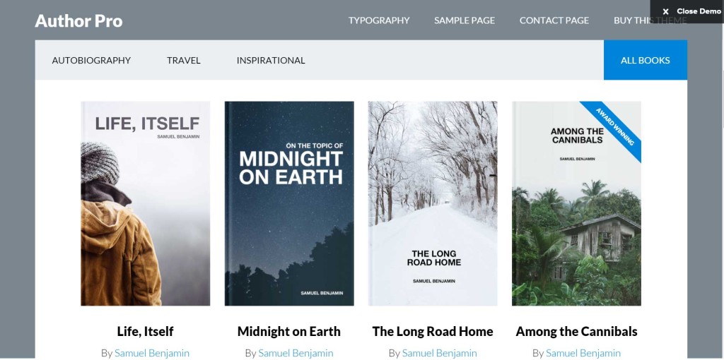
Sometimes it’s easy to recommend a new WordPress theme for writers and authors. You see it and you just know that the designer is also an author and understands the challenges involved with having a good site. The Author Pro Theme is just such a theme.

The theme includes all of the fundamentals, such as mobile responsive functionality (to make it look good on mobile devices) and hefty customization. But it stands out on two fronts:

1) A Landing Page feature that comes in handy when you want a no-distractions page for selling your book.

2) The $100 also includes the Genesis framework, which is a series of WordPress-compatible features like SEO tools and security. You also get personal support. From experience, I can tell you that Studiopress’ hand-holding is the best I’ve ever come across. If you don’t like to spend hours messing with plug-ins and code then the premium price is worth it.

Oh, wait a third benefit is the Author Pro plug-in which allows authors to easily add books to their sites. The books can display custom information, such as ISBN, description, price, publisher, and editor. This helps give the site a cohesiveness that any author who wants to sell books directly to the reader will want to have.


Download Author Pro Theme


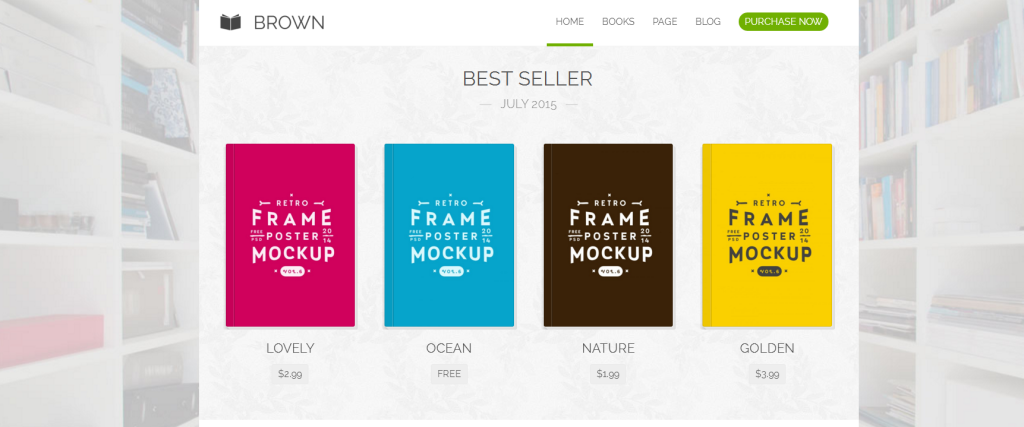
2. Brown 


brown wordpress theme for writers and authors


This theme has the worst name of any theme ever created (ever-ever!) but it also enjoys serious breadth. It stands out for its focus on simple layout and fast navigation from book to book and the books’ content. Clicking on a cover gives the customer a chance to read some excerpts. Other benefits of the theme include:

  • Responsive (looks nice on all devices)
  • Good support
  • Speed! Just be sure to optimize your images. No 1 megabyte pics allowed… ;-)


Download the Brown theme here


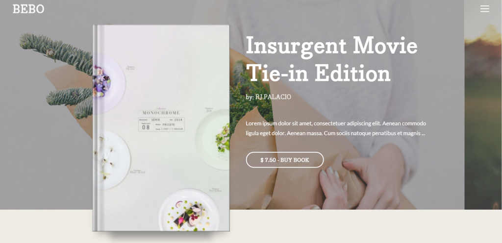
3. BEBO Author Landing Page 


screenshot-bebo.beautheme.com 2015-12-06 22-01-49


This WordPress theme for writers and authors stands out for its slick design and a couple of cool features that you don’t find everywhere.

  1. A timer widget. This lets you run a timed promotion on your site. These are available as a plug-in for your WordPress site, but it’s cool that the feature is built in.
  2. Three styles. All of them are nice looking too.

Other features include mobile-friendly design, video and an attractive master slider that will give you a chance to highlight your book cover.


Download the BEBO WordPress theme for authors here


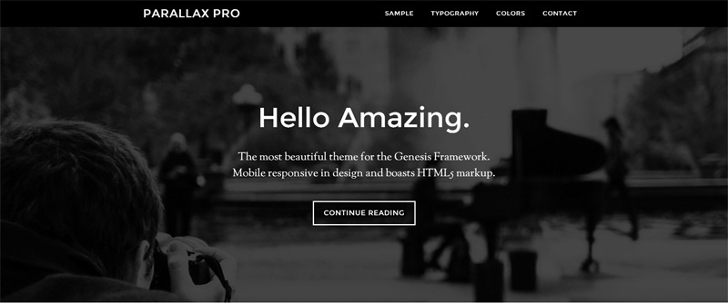
4. Parallax Pro 


Parallax-theme-for-writers-


Parallax sites are those sites where scrolling down adds nifty animations like sliding, fades, color changes, etc. It’s a cool trick and people still go nuts for a good Parallax site. The best one I’ve seen as far as simplicity and extension is Parallax Pro. It’s on the pricier side, but the hundred bucks includes the Genesis Framework, which allows for easier updating and editing when it’s time to make changes to the site.

Highlighted features (in addition to the Gensis Framework) are Landing Pages (necessary for your books and for promotions like newsletter sign-ups), HTML 5 markup and fully mobile-friendly.


Parallax Pro Theme


5. X | The Theme 


X theme for authors and writers


X | The Theme is a catch-all kind of theme, promising a full suite of tools for everyone. This is especially true when you consider the fact that X is actually a suite of themes, not just one. Yup, the developer has crafted a single package with multiple designs, one of which will likely fit your needs. X also comes with a suite of free tools (like Mailchimp integration). This saves time and heartache caused by third-party plug-ins.

Here’s a list of features:

  • WooCommerce integration
  • Extensive styling options
  • SEO optimization with 2015 ideas
  • Shortcodes
  • Responsive
  • Disqus or Facebook comments extension
  • Free Soliloquy slider


Download X | The Theme here


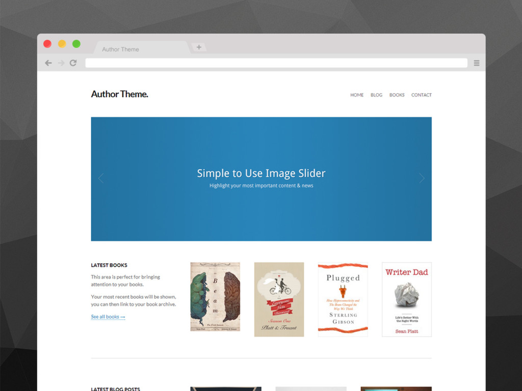
6. Author Theme for Writers 


Wordpress themes for writers and authors


If simplicity and focus is your thing (and it should be) then you’ll need to consider this WordPress theme for writers and authors. The layout is simple, the slider is an unbloated, straight-forward thing and the product pages have almost everything you need. The one missing feature is a way to read a sample.

Highlights from the features list are:

  • Easy to use Options Panel
  • Premium Documentation & Support
  • Built in Slider
  • Custom Background Image/Color
  • Custom Button & Link Colors
  • Custom Logo Upload
  • Custom Reviews Shortcode (I like this idea!)
  • Book Page Templates (YAY!)
  • Google Font Integration


Get Author Theme for WordPress here


7. Preface: A WordPress Theme for Writers and Authors  
 

Wordpress Theme for Authors


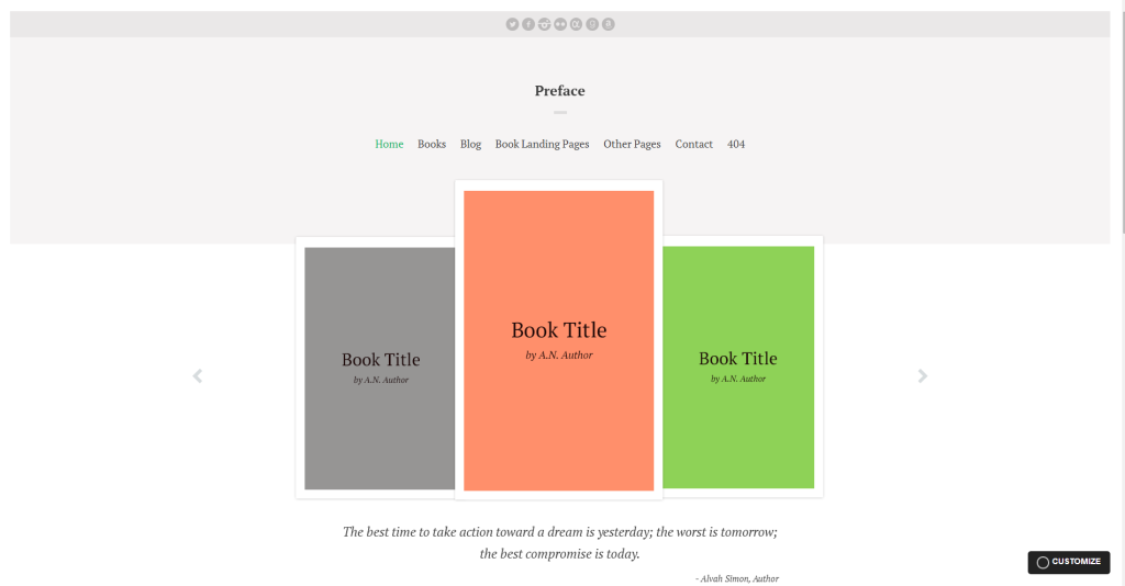
The thing I love the most about this theme is its simplicity. One of my main rules for a good book site is an elegant, FAST first impression. Preface does that well. Moving between pages is like lightning. And each page shares a look and feel that makes it easy for me to see what the author wants me to see. If I had to guess which theme was written by an actual author, it’s Preface. The list of features bears that out:

  • Book categorization
  • Book Launch Landing template! (FINALLY!)
  • Book Filter template (Useful for large libraries)
  • Showcase your books from your 404 Page (Clever. Essential.)

Get Preface: A WordPress Theme for Authors here


8. Bookish 


Bookish WordPress theme for writers and authors


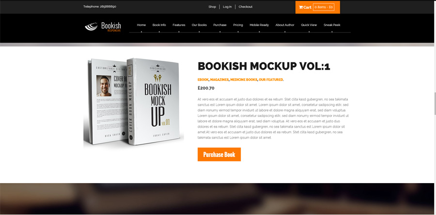
One of the details that set this theme apart is the parallax design. “Parallax” is the style that you see on some sites where the background image scrolls at a different speed than the image in the foreground. It’s a fun effect that can be used to guide the customer through your content.

The theme also touts the following features:

  • Works on mobile devices
  • WooCommerce compatible (to sell your own books)
  • Google fonts
  • Dark & White Layouts
  • Infinite Color Schemes
  • jQuery enhanced slider and effects.
  • Well commented code.

I read through the comments by users. There have been several bugs that have taken a while to fix. Bugs are common, but watch the discussion to see if the response time improves. Devs must support their themes, no matter how noisy (and annoying) customers get! If the outstanding bugs don’t appear to impact your goals, then consider the Bookish theme.


Get Bookish here


9. The Novelist: Responsive WordPress Theme for Writers and Authors  
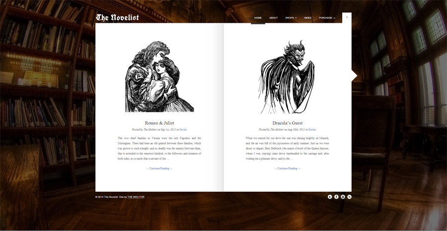
 

The-Novelist-Wordpress-Them


This theme is for those of you who lean heavily on excerpts to sell books. There aren’t a lot of page types (like in the Preface theme above) but it is a theme that lets you hone in on the work you do. Stumbling on a site that looks like an open book immediately tells the reader that they’re in the right place.

Among the features that the theme touts (beyond the bookish design) are Responsive design (to look good on mobile devices), support for the beautiful Google Fonts library and customized backdrops.

The theme has great ratings and folks seem happy with the FREE support.


The Novelist: Responsive WordPress Theme for Writers


10. Minimum Pro


Minimum Pro theme for writers


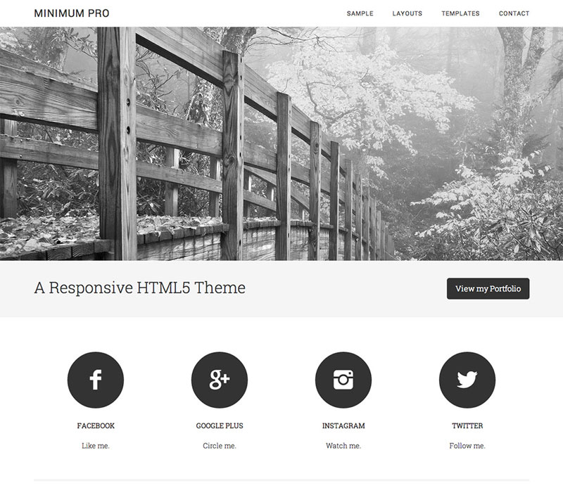
This theme offers:

  • Custom backgrounds and headers
  • Mobile-readiness
  • Threaded comments.

The $100 includes Copyblogger’s Genesis framework. Genesis is a toolset that makes the site easier to customize. It’s a good thing to have when you’re building a new website and still in design/self-education mode. Genesis adds features like:

  • One/two/three column pages.
  • Left/right sidebars.
  • Fixed-width, for when you don’t want tech messing with your content.
  • Custom headers/menus.

Why could this theme steal my business away from Cleanspace? It’s good looking, expandable, updated often, and it’s made by the Copyblogger folks who simply make excellent products with fast support. As I add more book series to my roster I’m positive that my website needs will change. If they do, I have my eyes on Minimum Pro.


Check out the Minimum Pro WordPress theme here


11. Cleanspace Business Theme. 


cleanspace theme for writers


I used this theme for years. It does a number of things well.

First, it looks great out of the box. I’d have to work really hard to make it ugly. And, believe me, I’ve tried.

Second, it includes a number of visual features that I like, including a huge slider that displays large images across the width of my site. The sliding animations that I’ve made with the tool are incredible. You can check out the slider on my homepage (note that I do turn it off sometimes, so I can’t promise it’ll be there).

Third, I chose my theme because it’s a premium theme. I want the support that comes with premium purchases. I’m not too happy with the help I’ve received from the developer, but the community is helpful. I’ve run with Cleanspace for several months without a hitch. Fingers crossed, but I think I chose a winner.

But one theme that always threatened to steal me away from Cleanspace is the next one on the list…


Download Cleanspace here


12. Rain WordPress Theme for Writers and Authors 
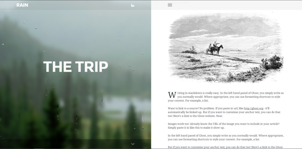
 

Rain WordPress theme for writers


If you’re looking for a WordPress theme for writers and authors that presents your content elegantly, check out Rain. It’s perfect for a site that is just for one book. You can upload an image of your choice and it appears fogged on the left side of the screen. You could put an image on the site that hints at a place or event in your story. Cool! The writing is presented in a simple, clean way (with Google Font support) and scrolling up/down from one page  to another is lovely.

I could do without the ability to play an ambient audio file, but to each his own. The site owner can turn the audio off.

Benefits of the theme include:

  • Designed and built by Elite developer. The boards have happy people and a load of comments by the creator.
  • Responsive (for mobile devices)
  • Table of Contents screen allows you to string together your content in a way that’s familiar to readers.

Beware of one thing. Widgets are not supported, which makes sense. You wouldn’t want to soil the sweet design with widgets, right?


Get Rain


13. Best 


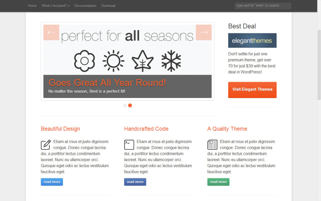
The simple Best theme includes:


  • Responsive design (meaning it will look good on mobile devices).
  • 3 page templates.
  • Multiple menu types.
  • Multiple page layout options.
  • Header/logo uploader.
  • Color options.
  • Change site background.
  • Shortcodes.


Best WordPress theme for writers and authors


Best is a simple theme, with a simple blog-like layout. It would work nicely for writers who plan to do more blogging than selling. If selling is important to you, though, you can skip to the next one.


Download Best here


14. Blackbird 


This is one of those solid themes that just look professional. Its features are pretty impressive, too.
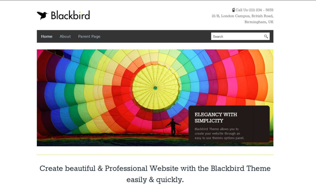
 

Blackbird theme for writers and authors


Includes (from their site):

  • 10 Different Color Skins, WordPress Themes to get Site Ready in 1 Click.
  • Individual Page/Post Customization – Change various layout options on each individual page (or globally if you want).
  • Dropdown Menus – Unlimited levels.
  • Mobile-ready.
  • Extensive documentation.

I do love the colors they make available. And you can switch between colors with a single click. When I used this theme I considered making a contest where I’d change the color once per week on Sunday; anyone who could tell me what the colors had been on my site the previous week would win a prize. I didn’t get around to doing it. But you could ;-)


Download Blackbird theme here


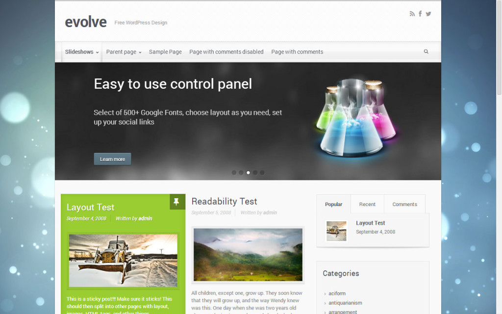
15. Evolve


I used this theme for about six months and was very happy with it. I somehow corrupted the site install one fateful evening, which made me look around for new themes. That’s when I ran into Cleanspace and we fell in love. But Evolve is a very competent free theme that I recommend to anyone who’s building an author site.

Benefits of the theme include:

  • Ready for mobile technologies.
  • Single blog post or blog grid layouts on the home page.
  • Slideshows.
  • Unlimited colors.
  • Over 500 Google Web Fonts.


Evolve WordPress theme for writers and authors


That last feature is a beauty. Google web fonts allow you to play around with type design on your site, which can be important to standing out in a crowded field and getting the important points across. Make sure you get a second opinion on how the site looks before you play around with fonts too much. It’s easy to get carried away and make your page look blechy.


Download the Evolve WordPress theme here


16. Themia 


Themia theme for writers and authors


This theme is similar to my own in that it offers a wide slider at the top that can dominate the screen. I like that look because it lets me highlight what I want without having to think too hard. All I have to do is upload an image, make a call to action and I KNOW that everyone will see it, because they literally cannot miss it.

I also like Themia for its full width/product pages and easy-to-read buttons.

Here’s a useful tutorial that will help you decide if it’s the theme for you:


Download the Themia WordPress theme here


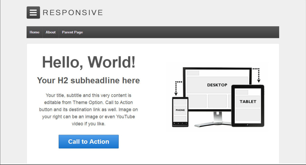
17. Responsive 


Responsive is another simple, free theme that I used for several months. It has a good rep for support even though it’s free. Nothing is more valuable to someone just starting out, with limited time to futz around with webbie doohickeys.

Some highlights of the theme include:

  • Adapts your website to mobile devices and the desktop or any other viewing environment.
  • 9 Page Templates, 11 Widget Areas, 6 Template Layout.
  • Easy Logo Upload, Social Networking and Webmaster Tools (we’ll discuss this in the plug-ins post later).
  • Responsive is WooCommerce Compatible (important if you want to sell books directly, we’ll also discuss this in the plug-ins post).
  • Multilingual Ready.
  • Search Engine Friendly.


Responsive WordPress theme for writers and authors


A great starter theme! It’s where I started ;-)


Download Responsive here


 NOTE: Some links are affiliate links. The themes I’ve tried before are noted and highly recommended. The rest of the themes look fantastic and have shining support according to the theme comments.

You might also like:

WordPress for authors and writers (part three)

WordPress for authors and writers (part two)

WordPress for authors and writers (part one)

Top 5 writing contests


Ben Zackheim


WordPress themes for writers: Build an author website with WordPress (Part Three)

WordPress themes for writers: Build an author website with WordPress (Part Three)

Our sordid story so far…

In the previous installments of WordPress for authors and writers, I’ve talked at you incessantly about the need for authors to focus. A good summary would be, “Define what you want out of your website and find the tools to make it so.”

But what does that mean? Well, if you’re looking to sell books then, in my opinion, it means apply BaB to every aspect of your site.

Bab? Isn’t that short for Barbara? No, that’s Babs.

My BaB is a design mantra that I think all authors should apply to their sites:

Books – show us your books!

action – give us an easy action to take now!

Blog – keep them coming back for more!

Why is the “a” lowercase? Because it should be right in the middle of everything you do, but not in an obvious way. The action should be obvious, logical and clear in its messaging. Does the action need to be a Buy button? Nope. It could be a sign up button, a follow me button or a play video button. But whatever action you want from the visitor it should be a central part of all design decisions.

Much of this theory is based on how people sell web services or non-fiction books (think weight loss programs and cloud services). But fiction writers need to start thinking the same way. We have something to offer and, if we band together, we can come up with standards that will help everyone sell their books from their site!

Someone asked me why they should even bother making a site that tries to sell their book. Their point was that Amazon spends millions on designing product pages that work, so why not just lean on the Amazon page. It’s a good point! Amazon makes great product pages. But they need to follow a one-size-fits-all road. They can’t design a page that’s meant to sell your book. They can only design a page that’s mean to sell “books”. As in “all books”. However, I do lean heavily on Amazon. When I point my visitor to my buy button, they DO go off to Amazon. But I’m not willing to depend on their site to sell my book. I think I can do a better job.

The problem with how authors sell books today

As I researched this post, I ran into author site after author site where I had no idea I was even on an author’s site. I’d see blogposts, images, links, all jumbled together. Some of the sites are really beautiful, but they don’t scream “BOOKS ARE HERE!” which they should if they want visitors to know that, well, books are there. One of the things I’ve learned after selling things online for 15 years is that your site is your business card. It needs to state what you do up front. It’s likely that you list “Writer” or “Author” in plain English on your card. You need to give your site the same focus.

Bottom line: Every page of your site should have one purpose, and you should focus on it like an ion cannon clearing the way for the Rebel envoys. This way your visitors will have all the information they need to decide whether or not you should get their money.

Tell the story of your site before you design it

I spent many months, working hard to craft a flow through my site that is enjoyable for the visitor and maximizes my chances at converting them into a paying customer.

I started by telling the story of my site. What does a site’s story look like? Mine was simple. I want visitors to notice my books. I want visitors to consider buying my books. I want my site to be entertaining and useful to people.

With those three thoughts in mind, I started to focus on how to make a site that makes these dreams come true.

Here’s the flow I wanted to create for my audience:

  1. With quality blog content, search engine optimization and clean code I’d bring the person to my site. I knew that a huge majority of them would know nothing about me, or my books.
  2. The visitor quickly notices she’s on a site where I have books to sell.
  3. She reads my blog post and sees the buy options for my books.
  4. The curious visitor exits to where I want them — namely, Amazon — where I cross my fingers and hope that Amazon (and my book copy on Amazon) converts them to a sale.

And this is exactly the flow I got! Google Analytics shows me it’s the path that a plurality of my visitors take.

But it wasn’t easy to get there. I worked with every web service and piece of software under the sun (from Dreamweaver to Kompozer to Blogger to Tumblr) I found the one-tool-to-bind-them-all.

WordPress.

It’s almost as if they created WordPress themes for writers and authors!

Read part four of my series of WordPress for authors and writers.


You may also like:

WordPress for authors and writers (part two)

WordPress for authors and writers (part one)

WordPress for authors and writers (part four)

by Ben Zackheim

The Ninja Librarian by Rebecca Douglass is a fantastic read [The 12 Authors of Christmas Blog Tour]

The Ninja Librarian by Rebecca Douglass is a fantastic read [The 12 Authors of Christmas Blog Tour]

The Ninja Librarian came out of nowhere. I don’t mean Ninja Librarian the man, I mean Ninja Librarian the book. As we set up the Middle Grade Elves book tour I was assigned Rebecca’s series. It certainly sounded interesting. As I read it I had a feeling I was enjoying something special. The pages turned and turned as I met some fascinating characters and twists and turns that delighted me. While this is a Middle Grade book tour, I highly recommend this series to anyone, of any age.

I had a chance to interview Rebecca about The Ninja Librarian. It’s a good primer for her book series, but should also be fun for those of you who have read the book.

Can you tell us how you came up with the idea of a ninja librarian?

The Ninja Librarian has a real-life model. Admittedly, Tom the Librarian from my work may lack some NInja skills. But he shares his looks with the Ninja Librarian–and was responsible for the line that started the idea bubbling in my fertile imagination: “I don’t get mugged; I’m trained to kill.” He really did say that one night at work, and the whole idea pretty much exploded into my head at once. Fortunately it was a slow night at work, because I had to grab pen and paper and start writing. Originally, I wrote the stories just for my co-workers, but I eventually realized I had a book others would enjoy, and began putting it together in earnest. The stories fell into a pattern of problem-solving and thinking outside the box that I liked, so I went with that.

Al reminds me of Deadwood’s Calamity Jane. What appealed to you about a “Wild West” setting for the stories?

I’m not really sure. The setting (Skunk Corners) was part of what entered my mind ready-made. The opening lines of the first chapter established the setting, and they have remained essentially unchanged since that memorable night at the library. Once I had Crazy Jake and Wild Harry Colson, the unspecified Wild West setting was inevitable. But you’ll not find Skunk Corners on any map, and attempts to nail it down to a time and place are doomed to disappointment.

There are so many little delights and surprises within each story. Were these originally short stories that you strung together? Or did you always want to tell a serialized story?

These started life very much as individual short stories. I had written several before I realized I was writing an episodic novel. Because the short-story format works well for kids (and others) who don’t want to commit to too much reading at once, I have stuck with that format in the sequel, Return to Skunk Corners, though I allowed myself more extended plot threads in that one. The self-contained short stories were also easier for me to write while working and raising the kids, because I could let more time go by between chapters without losing the thread of the story. As long as I finished each chapter fairly quickly, the rest could wait.

While you have a very strong and unique voice, the structure of your stories has a bit of a Sherlock Holmes feel. What are your influences as a writer?

Boy, those are probably too many to name! As a kid I read everything from Tom Sawyer to The Wind in the Willows to Homer Price, and the adventure stories of Robb White and (I’ll confess it) Louis L’Amour. More recent influences are Richard Peck, Gary Paulson, Karen Cushman, and an awful lot of books on the settlement of the West, especially through the eyes of the women and children. My fascination with that period in our history probably influenced the setting quite a bit. And using a first-person narrator for the first time worked wonderfully to help me find my voice–my tendency to dry humor worked better that way!

Where did the name of the town come from, Skunk Corners?

I’m pretty sure it was just lying around when I started writing. Well, almost. When I wrote the very first story, it was Skunk Springs. When I wrote the second story, it had become Skunk Corners, and it was actually a long time before I realized I’d changed the name. But the skunks were always there.

Several times, you mention the pain of hunger that some kids in town suffer. Do you have a personal connection to this problem? It’s certainly a big part of our lives in America.

Happily, though we were poor growing up, we gardened, and my parents were creative, so we never went hungry. My Dad did, though, during the Depression, and some of his stories have stuck with me, as have accounts of kids crossing the prairies or settling in less-than-ideal places. I should probably add Laura Ingalls Wilder to the list of influences, and she wrote very feelingly of hunger at times, especially in The Long Winter.

If your story got the Disney treatment, what animals would Big Al, Tom, Tommy, Neb Jones and Tess be?

I like this twist on the standard “who would play your characters” question (which I can never answer anyway)! I’m pretty sure Al would be a bear. The Librarian is a tough one. He has elements of the big cats, but also of the fox, or even Coyote. On reflection, I think he might be the border collie–a smart dog, but not wild as the others–he’s the strange outsider with a little extra knowledge. Tommy and the other kids I could imagine as a troupe of squirrels (to keep it in the right set of animals) or maybe prairie dogs. Neb Jones is a sheep. Not a mountain sheep. A pretty dumb domestic sheep. And Tess. . . she’s a deer, but a wise one.

I understand that you also enjoy backpacking. How are backpacking and writing similar?

Well, both are better if once you begin you keep going to the end! And both go more smoothly with some planning, though they can be done by the seat of the pants. For many, backpacking is as solitary as writing, but I travel and hike with my family, so our trips are actually often more social than my life at home. For me, it’s more that backpacking helps refuel my mind and spirit. I get pretty weird if too much times goes by without getting into the wilderness.

When’s the third book out? ;-)

The next kid’s book isn’t a NInja Librarian story, but a somewhat tongue-in-cheek fantasy called Halitor the Hero. That will be out sometime in 2014. But I’m not abandoning Skunk Corners. At this point, I’m seeing a collection of stories by and about different people around town, not all in Big Al’s voice. I specified “kid’s book” above because my next release will be for the grown-up fans, a humorous cozy mystery (i.e., no blood, gore, bad language or much in the way of violence) called Death By Ice Cream, due out early in 2014.

Thanks so much Rebecca. I’m delighted to have found your wonderful work.

Thank you! I’m always so happy when people enjoy my work! I have Shirley Link on my Nook, queued up after a couple of library books (always have to read those first, before they expired and leave me mid-page!).

20131206-085611.jpg