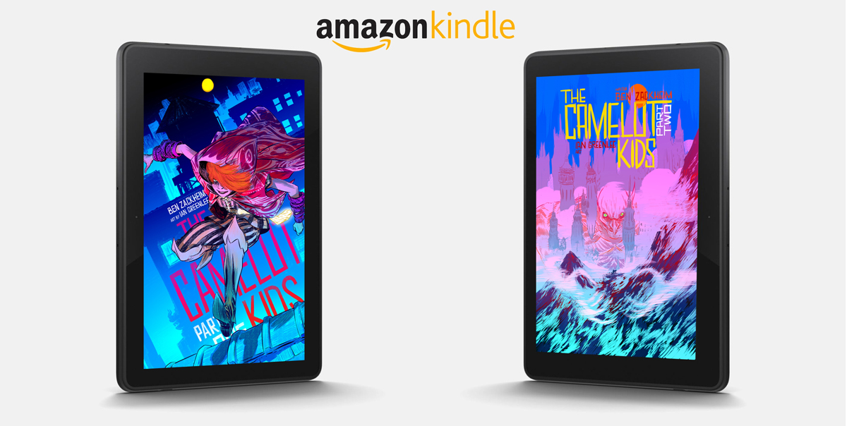
I’ve talked a lot about the softcover collection of The Camelot Kids coming out in December, 2014. Why am I so excited? Well, besides seeing the story all together in one volume, there’s the spectacular artwork of Ian Greenlee. Ian has been body slamming every single piece for The Camelot Kids eBooks (yes, in a good, loving way). His art is getting a lot of buzz in the illustration world. And readers LOVE what they’ve seen so far.
Here’s one review:
“I love love love this series!!
The illustrations are really really wonderful. I wish I had some to frame for my office.”
And another:
“This is the first in an exciting new middle grade series, by Ben Zackheim, with stunning illustrations peppered throughout, this one is sure to be a hit.”
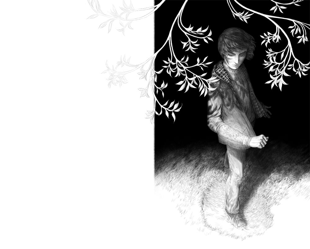
I want to give you a peek at how we’ll be using the artwork in the softcover edition. From the start, Nathan Fox (Art Director and cover artist) has wanted the illustrations to emerge from the story. His meticulous sense of theme and intent are woven into every visual decision he makes. For instance the theme of The Camelot Kids: Part One was “Emergence” which translated into wonderful illustrations of our characters stepping into a new world. But the softcover will give us a whole new way to play with the theme.
Example?
Well, when Simon Sharp finds the vambrace in the grass in Part One, it’s his first step into Merlin’s domain. Simon doesn’t know it at the time, but Ian did a fantastic job of showing the confusing, dramatic moment. In the book, you’ll be able to see the drawing in all of its detail, and you’ll notice how some art appears to embrace the text of the story. In the two-page spread below, notice how the leaves flow from one page to the next, like ivy growing through the prose.
 This is just one example of the beauty and attention to detail that you’ll find in The Camelot Kids: Book One, coming in December. Yes, THIS December ;-)
Head to Amazon and catch up on The Camelot Kids!

