WordPress for writers: Build an author website with WordPress (Part Two)
To read about how WordPress can help writers, see Part One!
In my experience, authors are hesitant to sell. That’s okay, as long as they do it anyway. (Tweet this instantly!)
I’m not going to tell anyone what their site should be. Only you know what you want to get out of it. You may just want to tell stories. Blog. Podcast. Post pics of cats. But if you want to use your site to highlight you and your books then I have some pretty strong, and well-tested, opinions. After years at Viacom, Sony, ESPN and AOL, building games and game sites, I can tell you that selling something requires focus.
With focus in mind, here’s what every fiction author website must do:
Highlight the books
Have one or two strong calls to action (sign-up for newsletter, buy, download)
Include blogging, video, illustrations, SOMETHING to keep folks coming back twice a month.
What does an author website need to have? BaB!
I call these fundamentals, BaB, which stands for Books/action/Blog.
Why BaB? Because it wraps up what your book site is all about. Selling yourself and your books.
Think about it for a moment. If you stumble on a site that’s selling something, you’ll visually scan it and, whether you know it or not, you’re making a lot of judgments in a split second.
- Is it pretty? Assuming you don’t go with a puke pink palette, Wordpress will help make that first impression go well. That’s one of WordPress’ biggest advantages. You need to work hard to make it look bad.
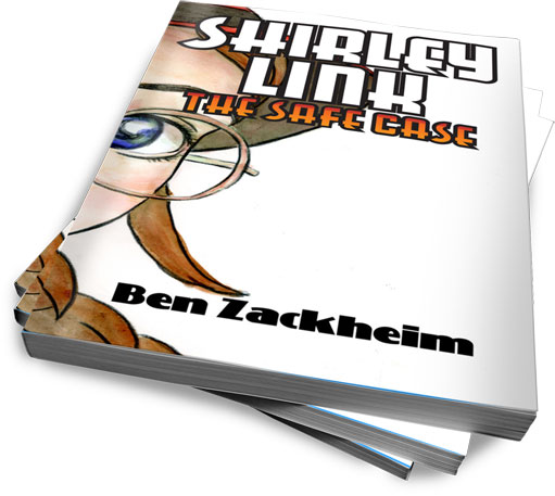
- What is being sold and does it look good? Get the best book cover you can afford and highlight it with a WordPress product page. I’ll cover the top themes with product pages in a later post.
- What else is here for me? News? Advice? Videos? Contests? Podcasts? Ways to share? Which social network is important to this writer? Is the site worthy of bookmarking?
By executing on the above three points, your site will do the most important thing it can do for you …
…show the reader what your priorities are…
You know how biz folks are always talking about how smart people remove all obstacles to buying a product? The same holds true of site design. Don’t make me think! Do not assume that I found your site because I wanted to see your book, or you. Odds are I did a search and stumbled on you. Now it’s up to you to convert me. Yeah, it’s like sprinting from a standstill. It’s hard, but you have to try.
Want to see what I mean? Okay, go to Jay Asher’s author page.
I’m not nuts about the overall design, but all the elements of BaB are there, and they’re in the right place. Notice the big honkin’ Buy Button in the upper left, which is where most eyes land when they first look at a page. I’m asked to buy before I even know what the product is! But that’s okay because, lo and behold, there’s the pic of the book. Now I know I’m on an author’s site. Jay gives more prominence to News than to Reader Reviews, which is odd, but they’re both really obvious from the get-go.
In the top menu I see there are a whole bunch of reasons for me to come back to the site if I like the book. There are links to his blog and to videos that tie in with his books. The site is bookmarkable. I would also follow the site, which I’ll explain in a later post.
So, yes, Jay Asher’s site has BaB! The books and buy action are tied at the hip on the top of the page, which is how it should be. And there’s content to keep the reader coming back to see what he and his characters are up to next.
Maggie Stiefvater‘s site tackles things in a different way. But let’s check out what she does and (maybe) why. Does Maggie have BaB?
It’s a design-heavy site, with a long load time, but when it does load it intrigues (just like her writing). She knows her audience (young adults) and her pub has made a judgment that the design of the site must capture her audience’s eye and let them know they are definitely in the right place. Since Maggie is busy building a very potent brand, where she is the product, she’s very prominent. Still, notice the biggest words on the page? “Welcome Reader”. She knows that she needs to let folks who don’t know her well that they’re on a writer’s site. Books are here. If you navigate to the books, you’ll find a very succinct and pretty presentation. You can also get fresh content if you come back to the site for her blog.
But this is where things fall apart. Where can I buy her books? Nowhere. I need to either search for the books manually on my site of preference, or go to one of the books’ official sites. From there I can find a Where to Buy section waaaay down on the page. Maybe the publishers figure she has a big enough name so they don’t need to worry about losing sales. But even the slightest bump in the road to purchase is lost money.
I’ve noticed this weakness in a lot of big publishers’ author pages. Maybe they know something I don’t know, but I’d say a design that hides the buy button isn’t doing anyone any favors. Including the readers.
So enough with the studies. How can you take this simple concept of BaB and apply it to your site with WordPress? We’ll explore the answer in the next post.
See what a good landing page needs to have to get the job done. And read part three of my series on WordPress for authors and writers.
You may also like:
WordPress for authors and writers (part one)
WordPress for authors and writers (part three)
WordPress for authors and writers (part four)
by Ben Zackheim

