I’m a huge fan of Google’s products. I like their search. I like their email. I even like Google+, even though I use it as often as I use my treadmill, which is to say, “whenever all other possible activities have been exhausted.”
But one big disappointment, especially for a lot of writers, has been Google Drive. Many writers eagerly waited for the cloud service to launch once we started leaning heavily on Google Docs (for writing) or Google Play (for “writing music”). Wouldn’t it be great to see everything I worked on and listened to in one place?
But the launch product was average, at best. Google Drive (gen 1) wasn’t all bad. It had a good amount of free storage, the best fee per gigabyte this side of Microsoft, and the standard low-frills design which allows you to just get to work. But it’s been missing something critical. Like a burger without fries, like an Internet connection without broadband, Google Drive was missing an iPad app.
Oh, they released an app, sure. But it was a read-only experience, making it about as useful as my treadmill. I gave the app a bad review, bought some apps that promised Google Docs integration and cursed the Google Gods, for all the good it did me. The also-ran writing tools in the app store work okay, but there were always hurdles to getting the apps to work flawlessly.
What’s a guy to do? I mean, they don’t want me to just be patient, do they?
So, at last, we have it. The new Google Drive for iPad (and Android tablets) finally allows for seamless, integrated editing. No longer will iPad writers have to use the dreadful web service. No more breathing wrong on the screen and accidentally messing up your perfectly edited sentence (if you used Google Drive or Docs in Safari for iPad, you know what I’m talking about!)
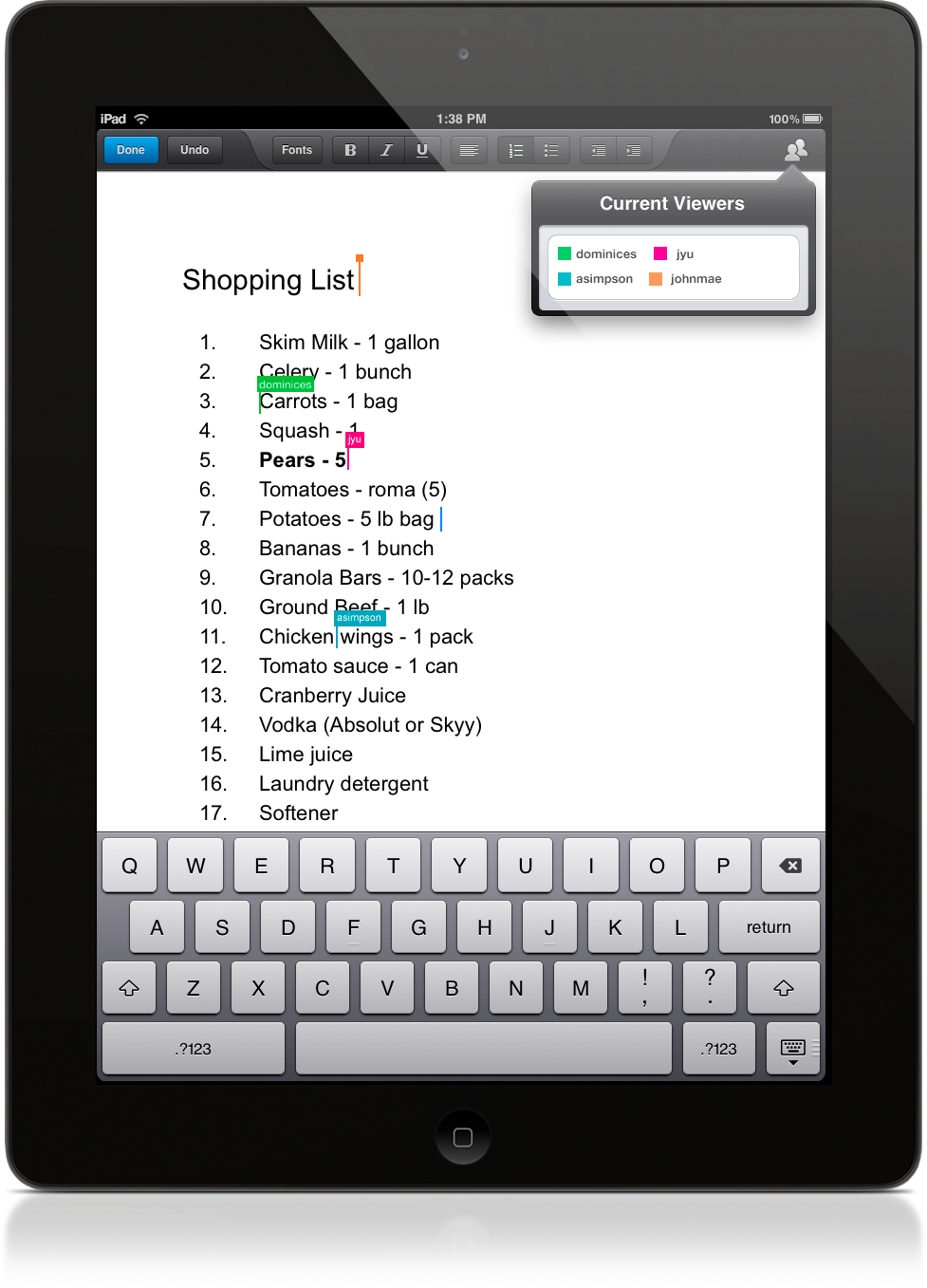
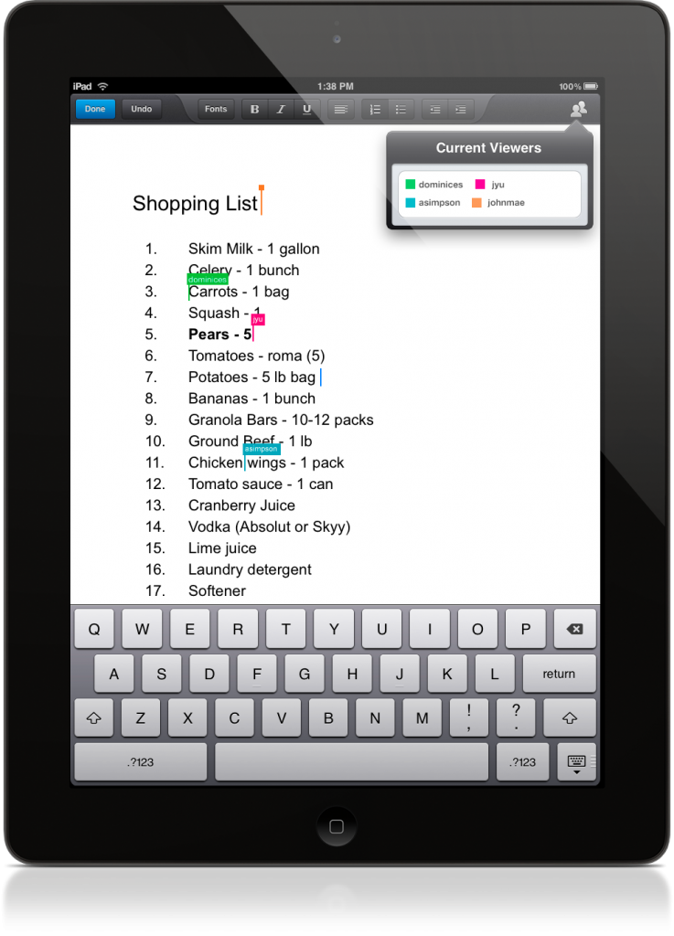
The new app, like the old one, allows you to view the document from Google Drive/Docs. But now there’s a beautiful Edit button at the top. Click on that and the screen rolls out an integrated editor. Like the online version, it’s no-frills. You get basic formatting options, a number of nice fonts and easy access to folders. But the app really shines in how it feels to write. It’s perfect. Flipping back and forth between reading your doc and editing it with the keyboard is seamless and tight. Only confident swipes of the screen will make the app respond to gestures, which is a welcome relief from many other editors, including Google’s online Drive service. The look and feel may be the reason why we had to wait so long for this app. Having worked in software development for a long time I can see that a lot of work went into a strong user experience.
Google Drive for iDevices also lets you collaborate with other writers, with built-in sharing that’s as easy as the one on their web service. It’s a good thing for those of you who partner up on docs and presentations. Me, I roll alone. After accidentally writing my daily diary in a shared doc and getting responses (in real-time) to my dream about Cher, I think it’ll be a while before I use sharing again…
With the simplicity of the app come some drawbacks. The font selection is limited. I can’t import the installed fonts from Google Doc’s robust online selection, though the doc I’m working on now recognizes the custom font I’ve been using — it just doesn’t allow me to use it anywhere else in the file. If I want to change the font to something not in the default library of fonts I guess I’ll need to go online to insert it. Ultimately, it’s not a big deal, in my opinion.
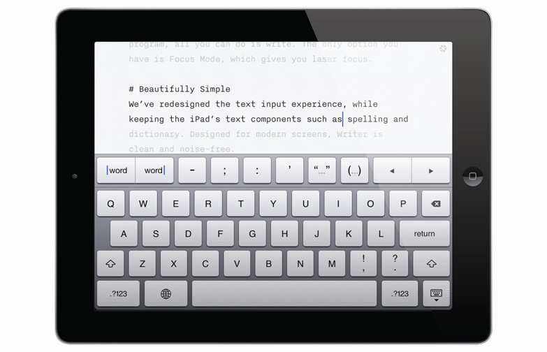
A nice-to-have would be an onscreen keyboard with the extra functions you can find in iA Writer. Quick parentheticals, dashes and spacing would probably retire my computer as a writing tool. Here’s an image of that beauty of a keyboard.
Bravo to Google for treating this app with the respect it deserves. It’s hard to wait for a good thing sometimes, especially when the wait ends in, well, disappointment. But I can finally say that exceptional Google Drive/Docs editing is available on the iPad. For free.


Trackbacks/Pingbacks